
Bedroom Design · Northern Virginia
How to Design a Bedroom That Feels Restful and Put-Together
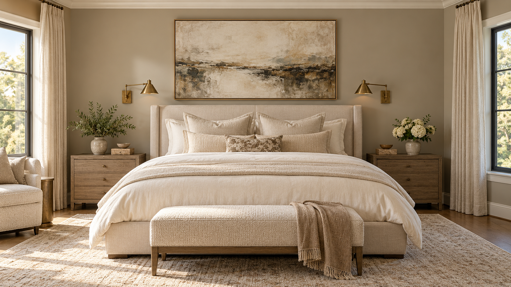
A restful bedroom starts with one strong design decision, usually the bed and its wall, then builds outward. Limit your palette to three materials, keep the ceiling and upper walls light, and layer your lighting so you’re never relying on a single overhead fixture. Everything else follows from those choices.
Bedrooms are the rooms people put off the longest. The kitchen gets renovated, the living room gets furnished, the dining room gets its table. The bedroom ends up with whatever didn’t fit somewhere else, the original builder-grade light fixture, and a paint color chosen in 15 minutes. We see this in nearly every home we walk into for the first time.
The result is a room that’s functional but not restful. There’s nothing cohesive holding it together, and the lighting is usually doing real damage. Getting a bedroom to feel genuinely restorative takes less effort than most people think. But it does require a few intentional choices made in the right order.
Choose One Strong Anchor First
Every well-designed bedroom has a clear visual focal point. For most bedrooms, that’s the bed wall. The headboard, the bed frame, the art or treatment above the bed, and the lighting flanking it form the most important composition in the room. When this decision is confident and well-considered, everything else becomes easier. When it’s unclear or half-decided, the room never quite settles.
Start by deciding how you want the bed to read. A substantial upholstered headboard in a neutral fabric creates warmth and softness. A wood headboard or a four-poster frame in a natural tone adds material interest without pattern. A simple, low-profile platform bed works well in smaller rooms because it doesn’t fill the visual field.
Once the bed itself is decided, think about what goes on the wall behind it. Art hung centered above the headboard at the right scale, or a grouping of smaller pieces arranged with care, can finish the wall in a way that reads as intentional. A simple painted panel in a slightly deeper tone, or a strip of wallpaper as a headboard-height accent, can also create definition without any artwork at all.
Flanking the bed with matched lighting, whether hardwired sconces, pendant lights hung from ceiling hooks, or well-chosen table lamps, gives the bed wall symmetry and purpose. This single move makes more difference to a bedroom’s overall quality than almost any other change.
The Three-Material Rule
One of the most reliable principles in bedroom design is to limit your visible palette of materials to three, not counting the wall color or ceiling. Three materials might be: a warm wood, a linen textile, and a brushed metal. Or natural rattan, cotton, and painted wood. Or stone, linen, and woven wool. The specific combination matters less than the discipline of limiting it.
When a bedroom has four or five competing materials, the space tends to feel visually restless even when the individual pieces are genuinely nice. Three materials, handled with care, create a room that reads as considered. Each material plays a role: one grounds the room, usually the floor or a structural element; one warms it, typically the textiles; one adds detail, usually the hardware, frames, and smaller objects.
The three-material rule doesn’t mean the room has to look minimal. Layering within a material, varying the texture of your linens, or using multiple finishes of the same wood, adds richness without breaking the discipline. Complexity within a material reads as depth. Multiple competing materials read as clutter.
Before buying any furniture piece or selecting any textile, ask which of your three materials it belongs to. If it doesn’t belong to any of them, it’s introducing a fourth material that works against the room’s cohesion. That doesn’t mean you should never break the rule, but it helps to break it consciously rather than by accident.
Colors That Actually Help You Sleep
The most restful bedroom colors are soft warm neutrals. Creamy whites, warm gray-beiges, dusty sage greens, and pale blue-grays have all proven effective backgrounds for rooms intended for rest. These work because they don’t compete for attention. They recede visually and let the textiles and materials in the room do the work.
Cool stark whites can work in bedrooms with generous natural light and warm textiles, but they tend to feel clinical under artificial light in the evening. If you’re committed to white, test the sample in your actual bedroom at night with your actual lights on before committing. Many people choose their paint color on a sunny afternoon and are surprised by how different it reads at 9 p.m.
Deeper tones can work beautifully in bedrooms when handled correctly. A soft navy, warm taupe, deep sage, or dusty forest green on the walls creates a sense of enclosure that many people find genuinely restful, something close to the feeling of sleeping in a cocoon. The key is to keep the ceiling and upper walls lighter so the room doesn’t collapse visually. A color treatment on the lower two-thirds of the wall, or on the bed wall only, can give you the depth and envelopment without the heaviness. Our guide to choosing paint colors with existing furniture covers how to test these deeper tones against what you already have.
What tends not to work in bedrooms: bright saturated colors (they’re activating rather than calming), high-contrast patterns on dominant surfaces like the ceiling or large wall areas, and warm reds and oranges, which stimulate rather than soothe.
Layering Bedroom Lighting
The overhead light that came with your home is almost certainly hurting your bedroom. A single overhead fixture creates flat, even illumination with no depth or shadow, which makes a room feel institutional. Bedrooms need layered light, and the overhead layer is just one piece, not the only piece.
A well-layered bedroom has three distinct sources:
- Ambient light: the general background illumination. This might be recessed lighting on a dimmer, a ceiling fixture, or wall sconces that wash the walls with soft light. This layer should absolutely be on a dimmer. A bedroom with non-dimmable overhead light is a bedroom you can never make feel relaxing.
- Task light at the bedside: a dedicated reading light that can operate independently of the ambient light. A table lamp, a wall sconce, or a pendant at nightstand height with a shade that directs light toward the page. This lets one person read while the other sleeps without flooding the whole room with light.
- Atmosphere or accent light: low-level light sources that create warmth without full illumination. Small table lamps, picture lights on artwork, or soft LED strip lighting in a soffit or beneath a floating nightstand. These sources set the mood during the wind-down period before sleep.
A bedroom with all three layers on separate switches or dimmers gives you full control over the room’s mood from bright and energizing when you’re getting dressed to dim and warm when you’re winding down. This is one of the highest-impact changes you can make without touching any furniture or paint. Our full guide to layering lighting in a room goes deeper on every layer.
Furniture Arrangement That Makes Sense
In most bedrooms, the bed should be centered on the longest wall without windows, which is typically the wall opposite the entry door. This arrangement creates a natural focal point and is what most people expect to see when they walk into the room. It also makes the most of the symmetry that beds naturally suggest.
If the longest wall has a door or window that prevents centering, the next best option is typically the wall opposite the entry, even if the bed can’t be perfectly centered on it. Walking into a bedroom and seeing the bed ahead of you is the most natural arrangement spatially. What doesn’t work well is a bed positioned so that the first thing you see when you enter is the side of the bed or the foot of the bed pushed into a corner.
Nightstands should be sized proportionally to the bed. A 16-inch nightstand next to a California king looks lost. A 28 to 30-inch nightstand flanking a queen or king gives the bed visual anchoring on each side. If floor space is tight, a wall-mounted shelf at nightstand height, or a pendant light hung at bedside height in place of a table lamp, can substitute for a freestanding piece and free up the floor.
Dresser placement matters too. A chest of drawers placed across from the bed, easily accessible from the closet side of the room, tends to work well. Avoid placing large case pieces in the direct entry sightline, which can make the room feel crowded immediately on entry. The first view into a bedroom should feel open, not blocked.
Textiles, Storage, and the Finishing Details
The bedding is one of the strongest visual statements in any bedroom, so it deserves thoughtful attention. A duvet or coverlet in a solid neutral linen or cotton provides a clean base. A throw at the foot in a slightly different texture or a barely-warmer tone adds dimension without introducing pattern. Two or three decorative pillow sizes in coordinating tones complete the arrangement. More than that tends to create more daily hassle than visual payoff.
Window treatments in a bedroom serve two functions: light control and softness at the wall. Linen drapes in a natural tone address both, adding warmth while providing some light filtering. For genuine blackout performance, add a blackout liner behind the linen drape, or pair it with a roller shade in the same color as the wall, which becomes nearly invisible in daylight. Don’t sacrifice light control for aesthetics in a room where you actually need to sleep.
A cluttered bedroom cannot feel restful no matter how well it’s been designed. If storage is insufficient, nothing else you do will fully work. Built-in cabinetry is the most effective solution where the budget allows. A wall of built-ins in a warm wood with simple hardware provides substantial storage without the visual weight of multiple case pieces spread around the room. If built-ins aren’t possible, choose case pieces carefully. A low-profile platform dresser keeps the room’s visual height open. Deep closet organizers can do more work than a second dresser.
For smaller bedrooms, a few additional moves can make a significant difference. See our guide on how to make a small room look bigger for the full toolkit, but the short version is this: keep the ceiling and upper walls in the same light color, mount drapes close to the ceiling and let them fall to the floor, choose a bed frame without a heavy footboard, and keep the floor as clear as possible. All four legs of the bed on a rug, with no furniture pushed against every wall, also helps the room breathe.
Common Questions About Bedroom Design
What colors make a bedroom feel the most restful?
Soft warm neutrals are the most reliable: creamy whites, warm greige, dusty sage green, and pale blue-gray. These recede visually and let the textiles carry the interest. Avoid bright, saturated colors, which tend to activate rather than calm. Deeper tones like soft navy or forest green can work beautifully when the ceiling is kept light and the treatment is applied thoughtfully.
How do I layer lighting in a bedroom?
Work in three layers: ambient light for general illumination (keep it dimmable), task light at the bedside for reading (independent from ambient so one person can read while the other sleeps), and atmosphere light from small low-level sources like table lamps or picture lights. A bedroom with all three layers on separate dimmers gives you complete control over the room’s mood throughout the evening.
How should I arrange bedroom furniture?
Center the bed on the longest wall without windows, typically opposite the entry door. This creates a natural focal point and the best sightline when entering. Nightstands should be proportional to the bed size. Keep large case pieces out of the direct entry sightline to avoid the room feeling blocked on approach. The first view into the room should feel open and intentional.
What does the three-material rule mean for bedrooms?
Limit your visible materials to three (not counting wall color): for example, a warm wood, a linen textile, and a brushed metal. This prevents the room from feeling visually restless even when individual pieces vary in style. You can layer texture and finish within each material, which adds richness without breaking the rule. Complexity within a material reads as depth; multiple competing materials read as clutter.
How do I make a small bedroom look bigger?
Keep the ceiling and upper walls the same light color to push them visually higher. Hang drapes close to the ceiling and let them fall to the floor to make windows feel taller. Choose a bed frame without a heavy footboard. Use wall-mounted sconces or pendants instead of table lamps to free up the floor. Keep the floor as clear as possible and put all four bed legs on the rug.
How do you layer bedding for a designer look?
Start with a fitted sheet, then a flat sheet or a duvet in a solid neutral linen or cotton. Add a throw at the foot of the bed in a slightly different texture or complementary tone. Finish with two or three decorative pillow sizes: two large euros, two standard shams, and one or two accent pillows in a coordinating tone. The goal is a bed that looks made and intentional, not stacked or overdressed.
Ready for a Bedroom That Truly Restores You?
Our team works with Northern Virginia homeowners to create bedrooms that feel settled, personal, and genuinely restful. If you’re ready to stop putting your bedroom off, we’d love to talk.
Or call us at 703-891-1570 • [email protected]
Written by Shea Studio Interiors, Inc.
Our design guidance draws on 30-plus years of hands-on residential experience in Northern Virginia and Metro DC. Founder June Shea is a 2023 Virginia Top Designer, Best of Houzz winner, and NKBA member whose work has been featured in the Washington Post and USA Today.
Questions about your space? Reach out to our team.