
Color · Northern Virginia
How to Choose Paint Colors That Work with Your Existing Furniture
Start with your largest furniture piece and read its undertone: warm (honey, terracotta, cream-white) or cool (gray, blue-gray, bright white). Choose a wall color in the same undertone family. Test three paint chips on the actual wall in the room’s actual light before committing. The furniture does not need to match the wall; the undertones need to agree.
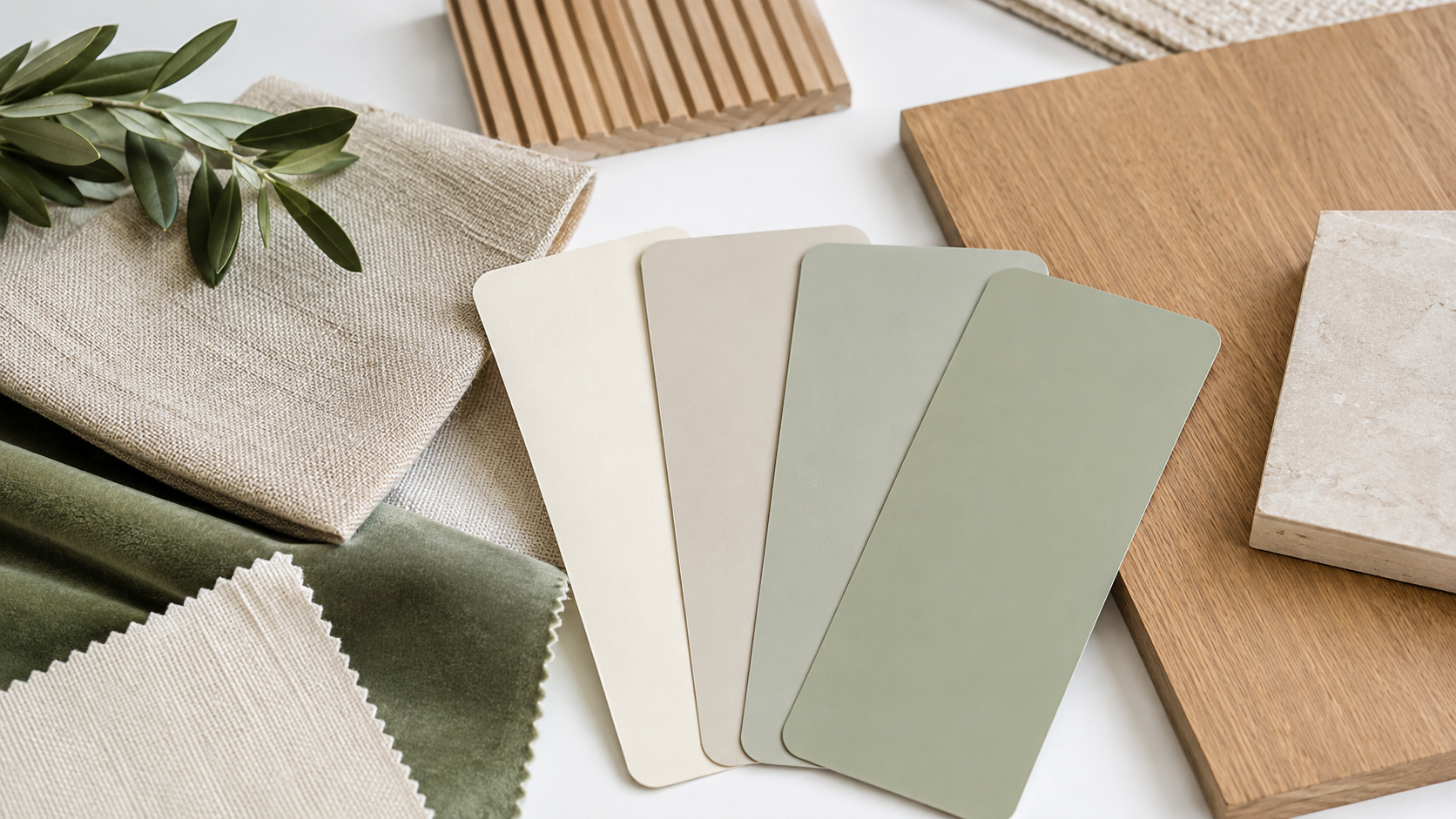
How to read your furniture’s undertone
Hold a plain white piece of paper next to your largest furniture piece. If the furniture looks warmer by comparison, it carries warm undertones (red, yellow, orange). If the furniture looks cooler or more gray by comparison, it carries cool undertones (blue, green, purple). The paper gives you a neutral reference that removes the room’s ambient light from the reading.
The undertone of a piece of furniture is not always the same as its apparent color. A gray sofa may carry a lavender undertone, a blue-green undertone, or a warm taupe undertone. Knowing which one it carries tells you which paint family to shop in. A warm taupe sofa paired with a blue-gray wall creates an undertone conflict that reads as unresolved even when people cannot articulate why. The same sofa against a creamy white or warm sage reads as cohesive because the undertones agree.
Wood furniture adds another undertone layer. Honey-toned or golden oak wood is warm. Walnut is cool-dark. Cherry is warm-red. White oak is near-neutral, leaning slightly warm. When wood pieces are the dominant visual element in a room, their undertone often outweighs the sofa undertone in determining paint direction. Read the floor as well: the floor is often the largest surface in the room and its undertone anchors the entire palette whether you notice it or not.
Warm furniture, which paint colors work
Warm furniture, including honey wood, caramel leather, terracotta, ivory, and cream upholstery, pairs best with wall colors in the warm family: creamy whites (with yellow or peach undertones, not blue-white), warm greiges, soft warm grays, sage greens with yellow-green rather than blue-green undertones, and earthy taupes.
Benjamin Moore White Dove, Sherwin-Williams Accessible Beige, and Benjamin Moore Pale Oak are common working companions for warm furniture because they share a yellow-cream undertone base that reads as cohesive against honey wood and warm upholstery. They are not identical, but they belong to the same undertone family, which is what creates the sense of a coordinated room.
Cool-toned whites like Benjamin Moore Chantilly Lace or Sherwin-Williams Extra White look clean and crisp in certain rooms, but placed next to warm honey wood furniture they often make the wood read as orange rather than warm-natural. That orange cast is the undertone conflict made visible. It does not mean the paint is wrong; it means the pairing is wrong for this furniture.
Warm greens, sage, and soft olive tones work beautifully against warm furniture because green sits between warm yellow and cool blue, and a warm sage leans enough toward yellow that it agrees with honey and terracotta undertones. See our comparison of warm vs. cool white paint for a deeper look at how undertones read across different room orientations.
Cool furniture, which paint colors work
Cool furniture, including gray upholstery, blue-gray or charcoal fabric, chrome or nickel metal frames, and cool-toned white pieces, pairs with wall colors in the cool family: blue-grays, soft blue-greens, cool-toned whites with blue or purple undertones, and clean off-whites without yellow in them.
Cool gray upholstery against a warm greige wall often makes the sofa look slightly lavender because the contrast forces the eye to read the cool undertone against a warm ground. Against a cool greige or a soft blue-gray wall, the same sofa looks properly gray. The wall is not competing with the furniture’s undertone; it is supporting it.
Creamy yellow-toned whites are the most common mistake pairing with cool furniture. The contrast reads as jarring because the wall’s warmth fights the furniture’s coolness. Swap to a clean crisp white or a pale cool blue-gray and the room settles. Farrow and Ball Pavilion Gray, Sherwin-Williams Repose Gray, and Benjamin Moore Pale Smoke are frequently cited as reliable partners for cool-toned furniture because they share the blue-gray undertone family.
Testing paint colors before you commit
Paint the test color on a primed piece of foam board or card stock at least 12-by-12 inches, not directly on the wall. Move it around the room at different times of day: morning light, midday, and evening with lamps on. North-facing rooms read paint colors cooler and darker; south-facing rooms read the same color warmer and lighter.
The sample in the store or on your phone screen is rendered under controlled lighting. Your room is not. A color that reads as soft sage in the store may read as olive-khaki in a north-facing bedroom that receives no direct sun. The same color in a south-facing room may read as bright yellow-green. Neither is wrong; both are accurate readings under their actual conditions.
Hold the foam board sample against your largest furniture piece for at least ten seconds before forming an opinion. First impressions are often overridden by the specific undertone contrast between the sample and the piece. If the sample makes the furniture look orange or lavender or gray when it is not those colors, the undertones conflict. Choose another option from the same hue family in a different undertone direction.
Test a minimum of three options. Testing one color and deciding is how most paint mistakes happen. The three options should bracket your target: one slightly warmer, one slightly cooler, and one at your intended value. Which one reads most naturally against the furniture in the room’s specific light is your answer.
Using the 60-30-10 rule as a color map
In a room with existing furniture, the wall color is your 60 percent (dominant tone), the large furniture and floor are your 30 percent (secondary tone), and accent pieces, pillows, and art are your 10 percent (accent tone). The wall and the large furniture need to share an undertone family; the 10 percent accent can introduce a contrasting or complementary pop.
The 60-30-10 framework is most useful when the room’s furniture is already in place because it tells you which elements are fixed and which have flexibility. If the sofa and the floor are both warm-toned and account for a significant portion of the visual field, the wall color selection has to harmonize with both. The 10 percent accents can pull in a contrasting color, which is often where people add a dusty blue throw pillow against warm greige and honey wood, and the room suddenly reads as composed rather than random.
For the full framework and room-by-room applications, see our guide to the 60-30-10 color rule. When wood tones in the room are mixed, such as a honey oak floor with a darker walnut side table, see our guide on how to mix wood tones without clashing before finalizing paint selection.
Room direction and natural light
North-facing rooms receive indirect, cooler light throughout the day: paint reads cooler and darker than on the chip. South-facing rooms receive warm, direct light: paint reads lighter and warmer. East-facing rooms are warm in the morning, cool by afternoon. West-facing rooms are cool in the morning and warm in the evening. Choose paint for the time of day the room is most used.
Northern Virginia sits roughly at 38 degrees north latitude. North-facing rooms in this region receive indirect, blue-sky light rather than direct sun at any time of year. This means cool-toned paint colors will read even cooler and may push toward gray or purple, and warm-toned paint colors may not read as warm as expected. A warm greige that reads beautifully in a south-facing room may read as a cool stone gray in a north-facing bedroom.
The practical adjustment for north-facing rooms: choose paint colors one step warmer than your natural instinct. If you gravitate toward a cool gray, try a warm greige. If you want a soft sage, choose one with a yellow-green base rather than a blue-green base. The room’s cooler light will neutralize that warmth and leave you with the color you wanted.
Not sure which color is right?
Shea Studio Interiors has helped Northern Virginia and Metro DC homeowners select paint colors around existing furniture for more than 30 years. We read undertones, evaluate room light, and narrow the field before you open a single sample jar.
Frequently asked questions
Do my paint color and furniture need to match exactly?
No. Exact matching is rarely the goal and is often not achievable even intentionally. What you are looking for is undertone agreement: the paint and the furniture belong to the same warm or cool family so they do not fight each other. A warm greige wall does not match a honey oak floor exactly; it agrees with it. That agreement creates cohesion without sameness.
What is the safest paint color to use with any furniture?
Warm off-whites and warm greiges are the most flexible partners for mixed furniture because they carry a neutral undertone that does not strongly conflict with most wood tones or fabric colors. Specific options: Benjamin Moore White Dove (warm white), Sherwin-Williams Accessible Beige (warm greige), and Benjamin Moore Pale Oak (warm neutral). Always test in your specific light before committing.
How do I choose wall color when I have multiple furniture pieces in different tones?
Identify the undertone of the largest piece first, then the floor. If both are warm, you are in warm paint territory. If the largest piece is cool and the floor is warm, look for a paint color in a neutral undertone family, such as a warm-cool gray or a greige, that bridges both without strongly amplifying either. Testing in the actual room is especially important when furniture tones are mixed.
Can I use a dark wall color with light furniture?
Yes. Dark wall colors against light furniture create a striking contrast that can read as either dramatic or grounding depending on execution. The undertone rule still applies: a navy wall (cool) pairs with cool-gray or white furniture cleanly; a deep forest green (warm-leaning) agrees with warm wood tones and cream upholstery. Test dark colors on a large sample area because they look significantly different at scale than on a paint chip.
Should I repaint before or after replacing furniture?
If you are planning both, select the furniture first and paint last. Paint is cheaper and easier to change than furniture. Selecting upholstery and wood pieces first gives you fixed reference points from which the paint can be chosen precisely. Painting first and then trying to find furniture that works with a committed color limits your options significantly.
Why does my paint color look different at home than in the store?
Store lighting is typically warm white fluorescent or LED that renders colors differently than natural daylight or the specific light fixtures in your home. Your room’s orientation, the time of day, and the colors of surrounding surfaces (floors, adjacent walls, furnishings) all shift how a paint color reads. This is why testing in the actual room under actual conditions is the only reliable evaluation method.
or call 703-891-1570