
Color & design principles · Northern Virginia
The 60-30-10 Color Rule: How to Actually Use It in a Real Room
The 60-30-10 rule divides a room into a dominant color at 60% (walls, large upholstered pieces), a secondary color at 30% (drapery, accent chairs, bedding), and an accent at 10% (pillows, art, hardware, lamps). The math matters less than the hierarchy: a room with a clear dominant color reads as settled and composed. A room where every color gets equal weight feels restless, no matter how good the individual colors are.
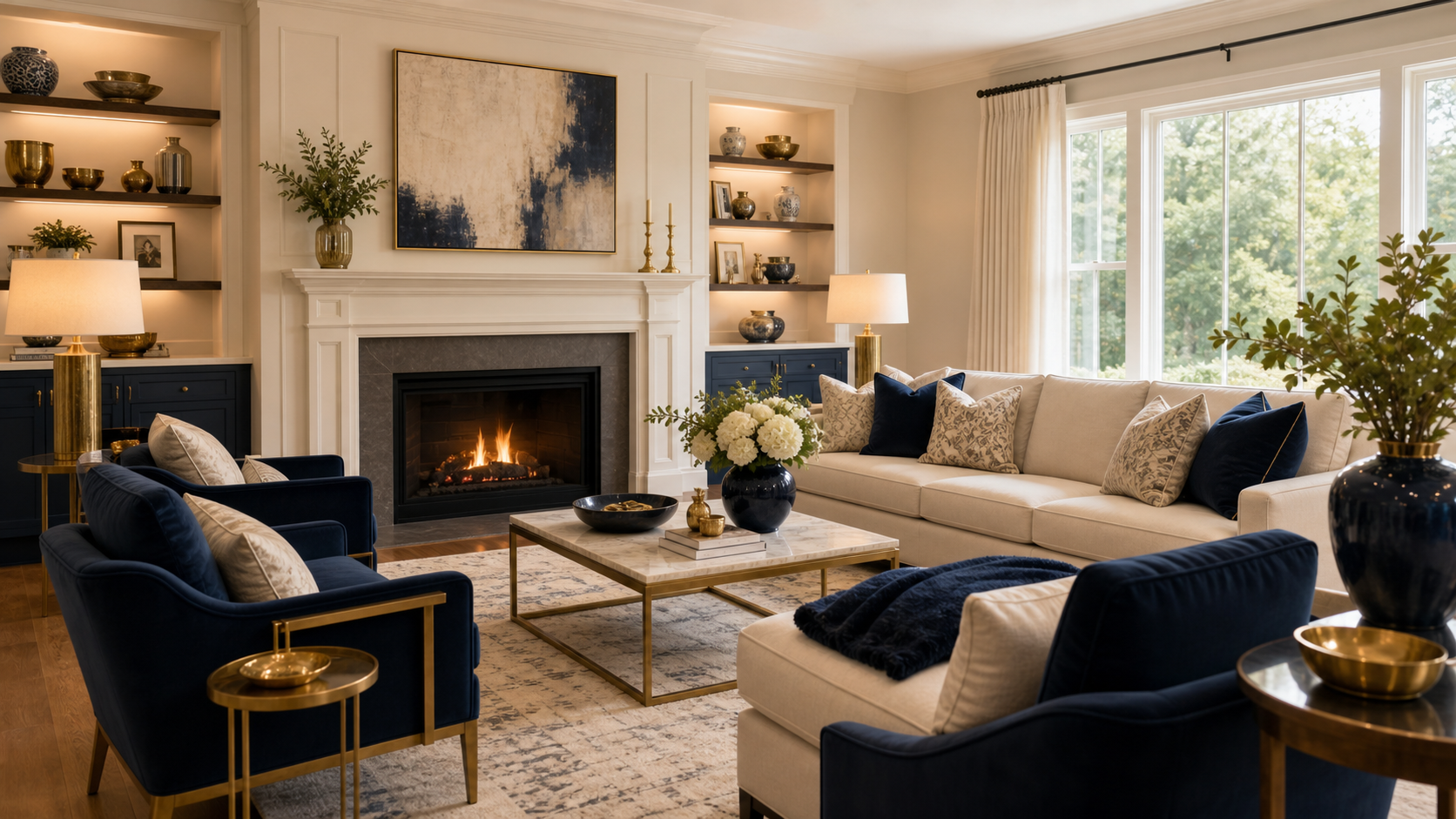
The 60-30-10 rule gets mentioned everywhere and rarely gets explained in a way you can actually use. Most articles say “use 60% of your dominant color, 30% of a secondary, 10% for an accent” and leave you to figure out what that means in a real room with real furniture. Here’s how it works in practice, what to do in an open-concept space, and the most common mistakes people make when they try to apply it.
What each percentage actually means
The 60% is your room’s foundation: walls, large upholstered pieces like a sofa or sectional, and floor covering if it reads as a color. The 30% is the supporting layer: accent chairs, drapery, a bed’s duvet cover, or a secondary upholstered piece. The 10% is everything smaller and more changeable: throw pillows, art, lamp shades, hardware, plants, and accessories.
The key insight is that the percentages map to surface area, not to item count. A sofa can be one piece of furniture, but it covers a lot of visual real estate, so it belongs in the 60%. Three throw pillows are multiple items but they cover very little area, so they belong in the 10%. When you think in square footage of visual attention rather than counting objects, the rule becomes much easier to apply.
Neutrals count. If your dominant is a warm linen white on walls and a cream sofa, white is your 60%, even though many people don’t think of white as a “color,” which is exactly why choosing the right warm or cool white matters so much. The 30% might be a dusty sage in the drapery and a pair of accent chairs. The 10% might be brass in the hardware and lamps. That’s a complete color story: 60% warm white, 30% sage, 10% brass. Not complicated, and very livable.
The most common mistake
The mistake is dividing the room into equal thirds. One bold sofa, one bold accent wall, one bold rug, all in different colors, all claiming the same amount of visual weight. Equal distribution of color creates a room that feels busy, unresolved, or chaotic. Hierarchy is what gives a room calm. The 60% needs to be clearly dominant, which means it should feel slightly boring on its own.
A dominant color that does its job doesn’t announce itself. It’s the backdrop. It reads as the room’s personality in aggregate, not as a single exciting choice. When clients come to us through our interior design services saying their room feels “too busy” even though they love all the individual pieces, the cause is almost always that no one color is clearly leading. The sofa is fighting the rug, which is fighting the drapery. Nobody wins, and the eye doesn’t know where to rest.
The fix is to look at the room and ask: if someone walked in and identified the room by its color, what would they say? A room dominated by warm cream says “warm cream room.” A room that’s equally cream, sage, and terracotta says “I’m not sure.” Commit to a leader. Let the other colors support it.
Applying the rule to an open-concept floor plan
In an open floor plan, the 60-30-10 rule applies to the whole visible space, not room by room. The dominant color should carry across the kitchen, dining, and living zones to create visual flow. The secondary and accent colors can shift zone by zone within that overall framework. One continuous 60% is what makes open plans feel unified rather than patched together.
This is one of the hardest parts of designing a great room or open-concept first floor. The living zone, the dining zone, and the kitchen all have different furniture types and different material demands, but the person standing in the living room can see all three. If each zone is its own color story, the space feels like three different rooms jammed together.
The practical approach: anchor the whole floor with one dominant neutral on the walls and in the largest upholstered piece. That neutral becomes the 60% for the entire square footage. Then introduce the 30% in one prominent piece per zone: drapery in the living area, dining chair upholstery in the dining zone, an island pendants color in the kitchen. The 10% accent can be consistent (brass, for instance) throughout all three. For more on how to design a great room that flows, see our page on open-concept floor plan design.
Using the rule with pattern and texture
Patterns count as color. A patterned rug that’s 40% cream and 30% navy and 30% terracotta introduces all three of those colors into your room’s balance sheet. Read the dominant color in the pattern, and that’s the color the rug contributes to your 60-30-10. Texture without a distinct color counts as the dominant if it covers large surfaces, such as a woven natural-fiber rug in a neutral room.
This is where most people get confused. They’ll choose a striped rug with four colors and not realize they’ve just added four colors to a room that already had a three-color scheme. The result is eight competing colors. Instead, the rule for pattern is: identify the pattern’s dominant color, and treat that as the single color the item contributes to your plan. A navy-dominant rug with cream and gold accents contributes “navy” to your color story. Let your three colors guide what patterns are eligible.
Texture is slightly different. A natural-linen sofa in a creamy off-white counts as the dominant color (cream) even though the texture is visually interesting. Rich texture in the dominant color is always good: it adds depth and prevents the dominant from reading as flat or boring. A nubby cream bouclé sofa, a smooth cream linen accent chair, and a cream Moroccan rug are all “cream” in the 60-30-10 framework, but together they create warmth and richness that no single cream fabric could achieve alone.
When to bend or ignore the rule
The rule is a starting point, not a law. A moody library with deep navy on all four walls and ceiling intentionally abandons the rule, and it works because the single color is so saturated that the room feels complete. A maximalist collector’s room might have a dozen colors and feel exuberant rather than chaotic because each item is museum-quality. But those are advanced design moves. For most rooms and most clients, hierarchy beats complexity.
The rule works best when you’re building a room from scratch or resolving a room that feels unresolved. Once you’ve established a clear color hierarchy, you can start making exceptions: a bold throw pillow in a color that breaks from the scheme, an art piece that introduces a fourth color. Individual exceptions don’t undermine the hierarchy because the dominant is already doing its job. Without that foundation, every exception amplifies the chaos.
The goal is always a room that reads as intentional. The 60-30-10 rule is simply the most reliable framework for getting there. If you want a broader view of how professional designers approach color and cohesion across a whole home, our guide on making a home look cohesive covers the whole system.
A color palette built for your home
Shea Studio Interiors designs color stories for Northern Virginia and Metro DC homes that work with your specific light, materials, and lifestyle. 30+ years, award-winning, and we’ve never met a room we couldn’t resolve.
Frequently asked questions
Does the 60% have to be on the walls?
No. The 60% is about visual surface area, not a specific material. In a room with dark navy walls and a large cream sectional, the sectional may carry more visual weight than the walls, making cream the effective 60%. Identify the color that visually dominates when you stand in the room. That’s your 60%, regardless of where it lives.
Can I have more than 3 colors in a room?
Yes, but you need a clear hierarchy. If a fourth or fifth color appears in a single small item, like a piece of art, it doesn’t disrupt the scheme because it doesn’t carry enough visual weight to compete. The rule breaks down when multiple colors all claim similar surface area and there’s no clear dominant. More colors are fine as long as the 60% anchor is holding.
Does the rule apply to patterns and textures or just solid colors?
Yes. Read the dominant color in a patterned fabric or rug, and that’s the color the piece contributes to your 60-30-10. A navy-dominant rug contributes navy. A cream-dominant patterned sofa fabric contributes cream. The pattern’s secondary colors are bonus texture, not separate color contributions to track.
How does 60-30-10 work in an open floor plan?
Apply it to the whole visible space, not zone by zone. The dominant color carries across all zones. Secondary and accent colors can shift by zone, but the dominant must be consistent enough to unify the space. If every zone has a different 60% color, the open plan reads as a series of disconnected rooms.
What if I want a mostly neutral room?
Neutrals work beautifully in 60-30-10. Your 60% might be warm cream, your 30% a soft warm gray, and your 10% a brass or warm honey tone. The rule still creates hierarchy; it just uses quiet colors. The discipline of having a clear dominant neutral is what separates a refined neutral room from one that reads as beige and boring.
Does white count as a color in this rule?
Absolutely. White is one of the most common 60% choices in upscale Northern Virginia interiors: white walls, white or cream sofa, white drapery. When white is the dominant, it reads as a luminous, airy base for more saturated secondaries and accents. White walls with an equally white sofa and equally white drapery, though, becomes a room where everything disappears. Even in a white room, there needs to be a dominant surface.
or call 703-891-1570