
Materials & finishes · Northern Virginia
How to Mix Wood Tones Without Them Clashing
Mixing wood tones works when you choose one dominant tone (usually the floors or the largest piece), then vary intentionally. Warm woods go with warm woods, cool-gray woods with cool-gray woods. The mistake isn’t mixing; it’s choosing two tones that are close in temperature but slightly different, so one looks faded or off rather than intentionally contrasted. Clear contrast reads as designed. Near-matches read as accidents.
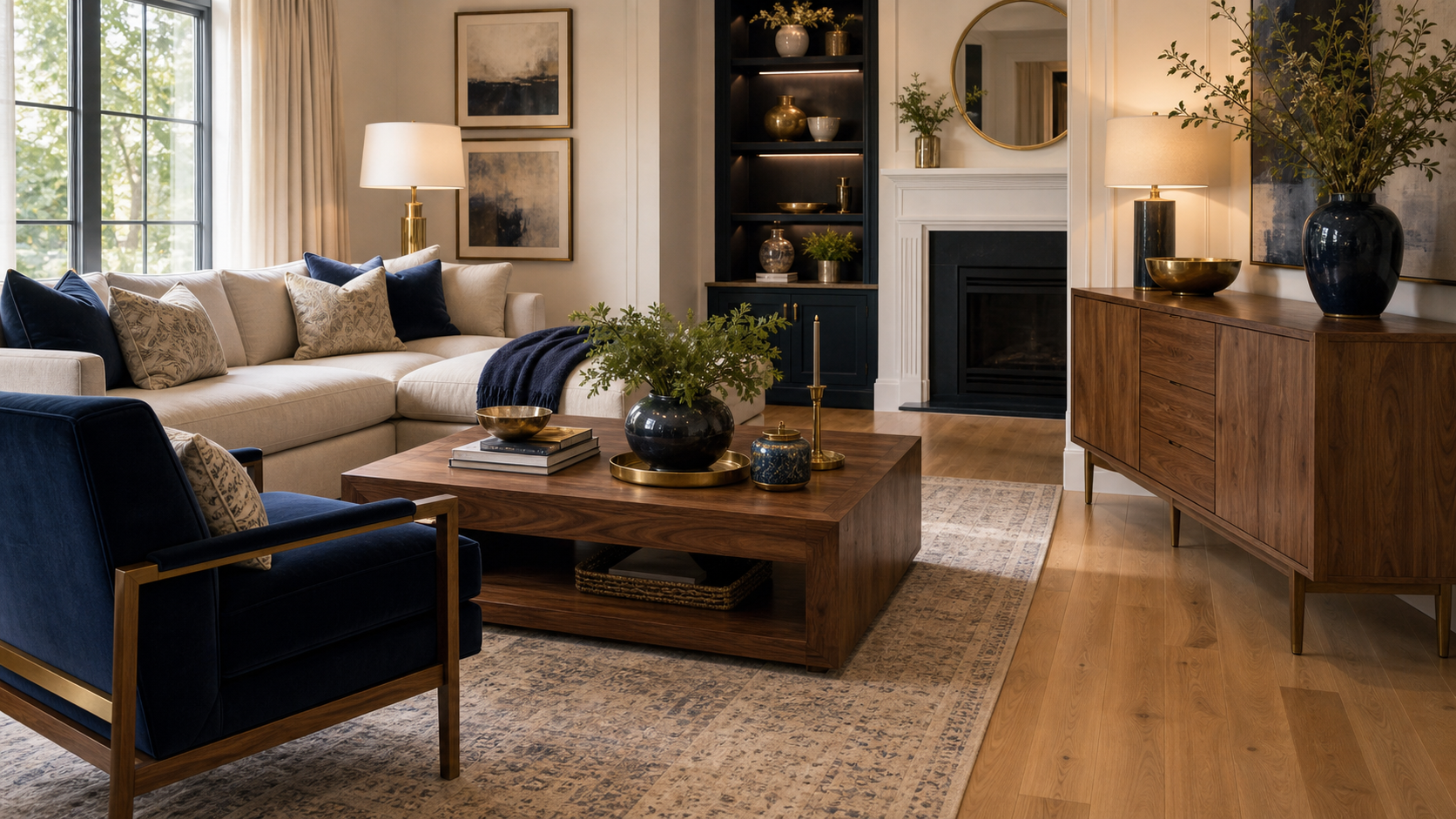
Perfect wood matching is a myth. No house has floors, furniture, cabinetry, and trim all from the same tree. The question isn’t whether to mix wood tones. It’s how to mix them so the room reads as curated rather than coincidental. Most rooms that look “off” have woods that are almost-the-same rather than clearly different, and that near-match is exactly what the eye catches and can’t stop noticing.
Start with an anchor piece
Every room needs one dominant wood tone that sets the baseline. In most rooms, that’s the floor. Everything else is measured against it: lighter, darker, or similar-but-different-enough. Without an anchor, every piece of wood furniture competes for the same role, and the room lacks hierarchy. Choose your anchor first, then work outward.
In a Northern Virginia home with white oak hardwood floors, those floors become the anchor tone for the entire first floor. A dining table in walnut reads as a dark contrast against pale oak, which is good: the relationship is legible. A coffee table in a honey-toned pine reads slightly warmer than the oak, which is also good if the rest of the room is in warm territory. What wouldn’t work: a coffee table in slightly grayed, slightly cooler oak, because that reads as the same wood that faded unevenly in one spot.
Kitchen cabinets can also be the anchor in a kitchen-dominant floor plan. When painted white or navy cabinetry is the visual dominant, natural wood appears as accent: a floating island top, open shelving, or a breakfast table. In that case the floor and the wood accents only need to be in the same temperature family, not the same tone.
Warm woods go with warm, cool with cool
Woods have temperature just like paint colors. Warm woods (honey oak, amber pine, warm walnut, teak, cherry) have yellow, orange, or red in their base tone. Cool woods (white oak with gray stain, ash, driftwood, gray-washed fir) have gray, green, or silver in theirs. Mix within a temperature family. Crossing from warm to cool in the same room is possible but requires neutral materials to bridge the gap.
This is the most reliable rule for wood mixing, and it mirrors the way undertone drives your choice of a warm or cool white paint. Walnut and oak are both warm-toned woods, just different values. Walnut is dark and rich; natural oak is lighter and honey. Together they read as a deliberate warm-toned palette. The same pairing in a cool-toned version would be dark ebonized ash and light white oak with a gray stain. Those two also work because they share a cool temperature.
The combination that doesn’t work: warm amber pine floors with cool gray-washed oak furniture. Neither wood is wrong in its own room, but they fight each other on temperature. The amber floor pulls toward warm, the gray furniture pulls toward cool, and the space never settles. If you have a cool-toned wood floor and want to add a warmer furniture piece, the answer is to anchor the room with enough neutral material (cream upholstery, white walls, stone counters) that neither wood has to carry the room’s whole temperature story. The same balancing act applies when you mix metal finishes against those woods.
The contrast threshold
If two woods are close in tone, they need to be at least 30% lighter or darker from each other to read as intentional contrast rather than as a near-match. A light-honey oak floor paired with a medium-honey oak dining table reads as the contractor used the same species for both and they aged differently. A light-honey oak floor paired with a dark walnut table reads as a design choice. Contrast needs to be legible.
This is especially important for pieces that sit close to each other or that you’ll see in direct comparison, like floors and a dining table, or floors and a kitchen island. When these surfaces are in close proximity, subtle tonal differences amplify. What looks like “mostly the same” in a furniture showroom under controlled light can look like a mistake in your home where the floor and the table are two feet apart under your window light.
The fix for a near-match problem is usually going darker rather than lighter. Adding a much darker wood piece against a mid-tone floor gives the eye a clear contrast to read. If the floor is light and you need a table, go dark. If the floor is dark and you need a table, go light or painted. Don’t hover in the middle.
Where mismatches hurt most
Woods that are directly adjacent are the highest-risk. Kitchen cabinetry next to a wood floor, a dining table next to hardwood, a wood coffee table on a wood floor with no rug underneath. The closer two woods are in space, the more their tonal relationship matters. Woods in separate zones of an open plan are far more forgiving because distance naturally softens the comparison.
Flooring transitions are a particularly common problem in Northern Virginia renovations, where an addition or a phased project might introduce two different hardwood species or stain jobs that now meet in a hallway. When two floors of different wood tones are visible through a doorway, the eye immediately reads the temperature and value difference. The options are: add a transition strip that draws a clear boundary, refinish both to match, or run both through the same space and make the difference intentional by going all the way to dark on one side.
Wood-on-wood is the other pressure point: a wood dining table sitting directly on wood floors. In this case, a rug underneath the table creates a visual break that lets both woods exist in the same space without forcing a direct comparison. This is one of the reasons rugs in dining rooms are nearly universal in well-designed Northern Virginia homes. For rug sizing guidance, see our area rug size guide.
What to do with existing floors
If you’re adding furniture or cabinetry to existing floors, identify the floor’s temperature first, then stay in that family for all warm wood additions. If the floors are warm amber oak, choose warm wood furniture: walnut, cherry, warm maple, or stained oak in a warmer tone. If the floors are cool gray-white oak, choose cool or gray-toned wood accents or go to paint for the cabinetry to sidestep the wood-on-wood issue entirely.
This situation comes up constantly in renovations where the floors are staying and the kitchen, dining, or living furniture is changing. The floors are the anchor by default, and coordinating the new pieces around them is a core part of our full-service design work. Your job is to work with their temperature rather than against it. If the existing floors are a challenging tone, a full sand-and-restain is often less expensive than a decade of furniture choices that don’t quite work.
When the floors are a true mid-tone and you’re genuinely uncertain which direction to go, look at the undertone in the natural grain. If there’s amber or orange in the grain, it’s warm. If there’s gray or green, it’s cool. Those undertones are present even when the stain is minimal or the floor has been refinished several times. Matching to the undertone is always more reliable than matching to the surface color alone. For the bigger picture on how materials come together, see our guide on making a home look cohesive.
Get the materials right from the start
Shea Studio Interiors specifies wood tones, finishes, and material palettes for projects across Northern Virginia and Metro DC. With 30+ years of project experience, our team knows exactly which combinations hold together and which ones create the kind of tension that’s hard to diagnose and expensive to fix.
Frequently asked questions
Can you mix oak and walnut in a room?
Yes, and it’s one of the most common and successful combinations. Both are warm-toned woods, but walnut is rich and dark while oak tends to be lighter and honeyish. The contrast is legible, both sit in the same temperature family, and the pairing has been a design standard for decades. Light oak floors with a walnut dining table or walnut coffee table are both well-established combinations.
Should floors and furniture match?
No. An exact match is almost impossible to achieve and looks odd when attempted because every lot of wood ages differently. The goal is same-temperature-family with legible contrast. Floors and furniture that match too closely look like the furniture is trying to disappear into the floor. Give them enough tonal distance to be clearly separate surfaces.
I have mismatched wood floors from two different renovation phases. What do I do?
The cleanest options: sand and restain both to match, which is the only way to make them truly cohesive; add a rug at the transition zone that visually separates the two floors; or run with the contrast by making one zone clearly darker or lighter than the other so the difference reads as a design zone change. The worst outcome is leaving two near-matching floors in direct adjacency without a transition.
How many wood tones in one room is too many?
Three is the practical maximum in most rooms: the floor, a primary furniture piece (dining table, bed frame, or sofa legs), and a secondary accent (open shelving, a side table, or a decorative tray). Four or more woods in one space requires very deliberate contrast management to prevent the room from reading as a lumber showroom. When in doubt, let paint or upholstery break up the wood count.
Do dark woods and light woods work together?
Yes, this is often the best combination: the contrast is clearly intentional. Dark walnut table on light oak floors reads as designed. The key is staying in the same temperature family: both warm, or both cool. Dark ebonized ash (cool) on light white oak floors (cool) works. Dark warm walnut on light cool gray-oak floors creates temperature conflict even though the value contrast is strong.
What’s the easiest way to make mixed wood tones look intentional?
Use a rug to interrupt the floor-furniture relationship. A rug under a dining table or seating arrangement visually separates the furniture from the floor, so the eye doesn’t force a direct comparison. A well-chosen rug can make two near-matching woods work together that wouldn’t read well in direct contact. It’s the single most practical tool for managing wood-tone tension in a finished room.
or call 703-891-1570