
Kitchen Design · Northern Virginia
How to Choose Kitchen Cabinet Colors and Finishes
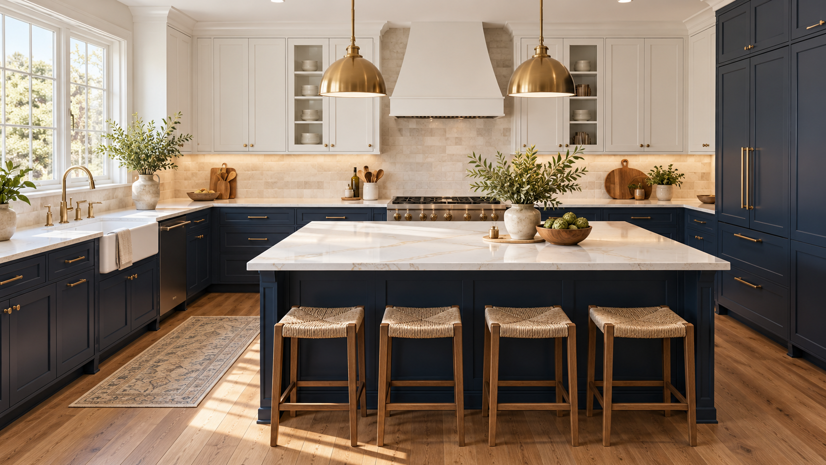
Cabinet color sets the tone for the entire kitchen, so it’s worth taking time with it. Start with your countertop and flooring (they’re harder to change), then choose a cabinet color that works with both. White and off-white remain the most timeless choices. Navy and forest green read as current and considered. Flat and shaker door profiles work across both.
Cabinet color is the most visible design decision in any kitchen renovation, and one of the most permanent. Countertops, backsplash, and hardware can all be changed at varying cost and effort levels. Cabinet color, while technically repaintable, is a decision most people live with for 10 to 20 years.
That’s worth saying plainly: if you’re unsure about a cabinet color, take more time with it. The decision deserves a full sample board, a week of living with it in your actual kitchen light, and an honest look at whether it will still feel right in a decade. Our team at Shea Studio Interiors works with Northern Virginia homeowners on kitchen renovations regularly, and the cabinet color decision is one we help navigate carefully. Here’s the framework we use.
Start with Your Fixed Elements
The most common mistake in choosing cabinet color is making the decision before committing to a countertop. The cabinets are the largest field of color in the kitchen, so they carry the most visual weight. But the countertop and flooring are the anchor elements, because they’re the most difficult and expensive to change after the fact.
If you have existing hardwood floors you’re keeping, pull a sample board of that floor with your countertop options. Then look for cabinet colors that work with both. The cabinet color decision is really about finding a tone that sits harmoniously between your floor and your countertop without competing with either.
Choose your countertop slab first. Countertops are sourced from real inventory in stone showrooms, and availability drives a lot of the decision. Once you’ve narrowed to one or two countertop options, then choose the cabinet color to work with them. Going in the other direction means you might fall in love with a cabinet color that fights your stone.
If you’re choosing all three from scratch, you have more freedom but the same principle applies. Countertops have the most inherent variation and the most limited selection at any given time, so they go first. Flooring goes second. Cabinet color goes third. This ordering saves you from the most common coordination headaches.
For a deeper look at how these decisions interact, our quartz vs. quartzite vs. marble countertop guide covers the material choices in detail, including how undertones in different stones affect the cabinet color decision.
White and Off-White: The Timeless Choice
White cabinets are the most popular choice for good reason. They’re bright, they make kitchens feel larger, they work with almost any countertop and backsplash, and they age well. A kitchen with clean white cabinets from the 1990s looks more like a current kitchen than almost any other cabinet color from that era.
But “white” is not a single color. The difference between a cool stark white and a warm creamy off-white can make or break a kitchen’s overall feeling. Cool stark whites can feel institutional, especially in kitchens with limited natural light. Warmer whites and off-whites read as softer, more welcoming, and more likely to work across different countertop tones.
Some specific colors that work well in Northern Virginia kitchens:
- Benjamin Moore White Dove (OC-17): a warm, slightly creamy white that works in almost any light condition. One of the most versatile white cabinet colors available.
- Sherwin-Williams Alabaster (SW 7008): similar territory to White Dove, with a slightly warmer undertone that reads particularly well with wood floors and natural stone.
- Benjamin Moore Chantilly Lace (OC-65): a cleaner, cooler white for more contemporary kitchens where you want crispness over warmth.
- Benjamin Moore Simply White (OC-117): bright but with enough warmth to avoid the institutional feel. Works well in kitchens with good natural light.
The practical rule: if your countertop has warm undertones, yellows and honey tones, go warmer on the cabinet white. If your countertop is a cooler gray or stark white stone, a slightly cooler cabinet white will harmonize better. Test both in your kitchen before deciding.
Navy, Green, and Saturated Color Choices
Navy blue and forest green kitchen cabinets have become one of the defining looks of the past decade. Done well, they have a quality that reads as intentional and sophisticated without feeling trendy. They add the kind of character and depth that white cabinets don’t provide.
Navy cabinets
Navy works best in kitchens with sufficient natural light. In a north-facing kitchen with minimal windows, even a beautiful navy can feel heavy and cave-like. In a bright, south-facing space, navy cabinets read as dramatic and grounding. Hardware matters significantly here: warm brass and unlacquered brass amplify the quality feeling of navy. Matte black hardware makes it more contemporary and graphic. Polished nickel gives it a more traditional, refined quality.
Forest green cabinets
Green cabinets, from soft sage to deeper forest tones, bring an organic warmth that navy doesn’t have. They work particularly well with natural stone countertops, especially those with green, gray, or warm undertones. A forest green kitchen with a waterfall quartzite countertop and unlacquered brass hardware is one of the most sophisticated kitchen combinations you can create right now. Soft sage, lighter and more muted, works in kitchens where you want color without commitment to drama.
Other saturated choices
Warm charcoal and deep slate blue read similarly to navy with slightly more warmth. Dusty blue-grays occupy the space between white and navy and appeal to people who want color without a bold commitment. Rich forest greens in the Benjamin Moore Salamander or Sherwin-Williams Rookwood Antique Green range are strong current choices in Northern Virginia kitchens we’ve designed.
Two-Tone Cabinet Combinations
Two-tone cabinet design has become a standard rather than a trend, and it’s easy to understand why. Pairing different colors on upper and lower cabinets, or treating an island differently from the perimeter, lets you introduce color and visual interest without committing to a fully saturated kitchen.
The most effective pairing is white or off-white uppers with a color on the lower cabinets. This works because the upper cabinets are at eye level and above, and keeping them light makes the room feel open and airy. The lower cabinets are the workhorse storage zone, and color there adds character without reducing the sense of space. Many homeowners who hesitate to commit to a full navy or green kitchen are very happy with navy lowers and white uppers.
An island in a contrasting color to the perimeter is another effective approach. A navy or forest green island against white perimeter cabinets creates a focal point and defines the island as a distinct working zone. The island color should be deliberately chosen from your overall palette, not picked at random. Our backsplash and cabinet pairing guide covers how to connect these decisions.
When doing two-tone cabinets, make sure both colors share the same temperature direction, either both warm or both cool. A warm off-white upper with a cool navy lower can create an underlying tension that’s hard to name but easy to feel. A warm creamy white upper with a warm navy (one with a slight green or teal undertone rather than a cold blue) reads as harmonious and intentional.
Finish Types and Their Tradeoffs
The finish type affects not just how the cabinets look but how they perform over years of daily kitchen use.
| Finish Type | Durability | Cleanability | Repaintable | Best For |
|---|---|---|---|---|
| Factory-sprayed paint | High | Very good | Yes | Most kitchens; widest color range |
| Site-applied brush paint | Moderate | Good | Yes | Budget repaints; touch-ups easier |
| Thermofoil wrap | High | Excellent | No | Smooth, modern look; moisture-heavy kitchens |
| Natural wood stain | High | Good with sealer | Not without stripping | Natural warmth; long-term commitment |
| Lacquer | Very high | Excellent | Difficult | High-gloss contemporary kitchens |
For sheen level on painted cabinets, a satin finish in the 30 to 40 percent sheen range is the standard recommendation. It offers good cleanability without showing fingerprints as aggressively as matte, and it doesn’t reflect light as harshly as semi-gloss or gloss. Matte finishes are beautiful but require more careful cleaning. High-gloss finishes photograph strikingly and suit very contemporary spaces, but they show every scratch and mark in daily use.
Factory-sprayed finishes, applied in a cabinet shop rather than brush-painted on site after installation, hold up better over time and are worth specifying when the budget allows. The edge seal and surface consistency of a shop-applied finish is consistently better than what’s achievable on site.
Read our kitchen design mistakes to avoid for a fuller look at the finish and specification decisions that come up most often in our work.
Hardware: The Final Decision
Cabinet hardware is the jewelry of the kitchen. It’s a relatively low-cost element that has an outsized effect on the overall look and quality reading of the space. Hardware selection typically happens after the cabinet color and finish are settled, because it’s the one element that can effectively tie together the cabinets, the faucet, the appliances, and any pendant lights overhead.
A few principles that guide our hardware recommendations:
- Match hardware to one other metal in the kitchen. If your faucet is brushed gold, choose cabinet pulls in brushed gold or unlacquered brass. If your range hood is stainless, matte black hardware creates a considered contrast. Avoid having three or more distinct metals competing in the same kitchen.
- Scale pulls to the door size. A 5-inch bar pull on a narrow 9-inch cabinet door looks out of proportion. A 3-inch cup pull on an 18-inch drawer looks undersized. As a starting point, the pull length should be roughly one-third of the door or drawer width for bar pulls, and a cup pull or knob for smaller doors.
- Matte black is the most versatile pairing for painted cabinets. It works with white, off-white, navy, green, and gray. It’s a current choice that doesn’t read as trendy.
- Brushed gold and unlacquered brass work best with white, off-white, and natural wood cabinets. They add warmth and a quality feeling that polished chrome doesn’t provide. Unlacquered brass patinas over time, which some people find beautiful and others want to avoid.
- Polished nickel reads as more traditional and formal. It’s a natural fit in classic white or off-white kitchens and pairs well with marble countertops.
Testing Your Color Before Committing
Before finalizing any cabinet color, test it in your actual kitchen with your actual light. Order a sample door from your cabinet maker, or ask your painter to prime and paint a single door sample. Look at it at different times of day: morning natural light, midday, and evening with your kitchen lights at full brightness.
Paint samples on small paper cards are not adequate for this decision. The large surface area of kitchen cabinets and the way artificial light changes color perception in the evening means a 3 by 5 inch card cannot tell you what a full cabinet run will actually look like. Shadows in corner cabinets, the reflective quality of countertops, and the undertones of your flooring will all affect how the color reads in practice.
Live with the sample for at least a week before finalizing. Colors that seem certain on day one sometimes look different on day seven. Colors that seem uncertain on day one sometimes settle in beautifully. The week is worth it for a decision you’ll live with for a decade or more.
Our team regularly works through material selection and cabinet color decisions with Northern Virginia homeowners as part of our kitchen renovation process. If you’d like guidance specific to your kitchen’s conditions and your home’s architecture, we’d be glad to help.
Common Questions About Kitchen Cabinet Colors
What is the most timeless kitchen cabinet color?
White and off-white remain the most timeless choices. White kitchens from the 1990s look more like current kitchens than nearly any other cabinet color from that era. The key is choosing the right tone of white for your specific kitchen. Warm whites like Benjamin Moore White Dove work in most spaces and light conditions. Cooler whites suit more contemporary kitchens with good natural light.
Should upper and lower kitchen cabinets be the same color?
Not necessarily. Two-tone cabinets, with white or off-white uppers and a color on the lower cabinets, are a well-established approach that works in many kitchens. Keeping the uppers light helps maintain a feeling of openness. The two colors should share the same temperature direction, both warm or both cool, to read as a deliberate pairing rather than a mismatch.
What kitchen cabinet finish is the most durable?
Factory-sprayed painted finishes, applied in a cabinet shop before installation, tend to hold up best for painted cabinets. The edge seal and surface consistency are significantly better than site-applied brush finishes. Thermofoil wraps are also very durable and easy to clean, though they can’t be repainted if you want to change the color later. For painted wood, a satin sheen in the 30 to 40 percent range offers the best balance of cleanability and durability.
How do I choose between white and off-white cabinets?
Look at your kitchen’s light and your countertop and floor undertones. A kitchen with warm golden hardwood floors and a marble countertop with warm veining will look best with a warm off-white or creamy white. A kitchen with cool gray stone and strong natural light can support a crisper, cooler white. Test both options in your actual kitchen, at night with your lights on, before deciding.
How does cabinet color affect home resale value?
White and off-white cabinets typically perform the best on resale because they appeal to the broadest range of buyers. Bold colors like navy or forest green are more specific to certain tastes and may require repainting for broad appeal. If you’re planning to sell within five years, neutral cabinet colors give you more flexibility. If you’re staying long-term, choose what you love and what works with your home.
What hardware finish works best with navy or green cabinets?
Unlacquered brass and brushed gold pair beautifully with both navy and green, adding warmth that contrasts with the coolness of the cabinet color. Matte black is a strong choice for a more contemporary, graphic look. Polished nickel works if you want a cooler, more refined finish. Avoid brushed nickel with navy or green, as the cool gray tone can make the combination feel flat and undefined.
Planning a Kitchen Renovation in Northern Virginia?
Cabinet color is one decision in a long chain of choices that make a kitchen work. Our team guides Northern Virginia homeowners through every step, from countertop selection to hardware finish to lighting layout. Let’s talk about your kitchen.
Or call us at 703-891-1570 • [email protected]
Written by Shea Studio Interiors, Inc.
Our design guidance draws on 30-plus years of hands-on residential experience in Northern Virginia and Metro DC. Founder June Shea is a 2023 Virginia Top Designer, Best of Houzz winner, and NKBA member whose work has been featured in the Washington Post and USA Today.
Questions about your kitchen project? Reach out to our team.