
Color & paint · Northern Virginia
Warm White vs Cool White: How to Choose the Right White for Your Room
Warm whites have yellow, beige, or pink undertones and feel at home with natural wood, warm metals, and south- or west-facing light. Cool whites carry blue, gray, or green undertones and suit bright north-facing rooms or spaces with chrome, stone, and modern palettes. The light in your room, not personal preference alone, should drive the choice.
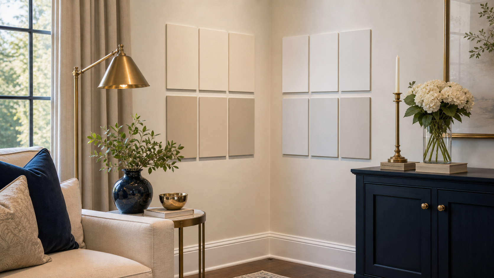
White paint sounds like the safe, simple choice. Then you are standing in a paint aisle holding forty chips that all claim to be white, and every single one looks different. Some read warm and creamy. Some read icy. Some look yellow under the store lights and gray on your wall. The difference matters, because a white that looks gorgeous in a McLean sunroom can look sallow or sterile in your north-facing Reston study. Here is what is actually happening and how to choose correctly.
What makes a white warm or cool?
White paint is never truly neutral. Every paint has undertones, a tint so slight it does not read as a distinct color until it covers your walls and catches your light. Warm whites contain yellow, beige, peach, or red undertones. Cool whites contain blue, gray, green, or violet undertones. The undertone is what you are really choosing when you pick a white.
Manufacturers control warmth by the pigments they add to the base. Warm whites might include a trace of raw sienna or yellow ochre. Cool whites lean on blue or violet tints. On most paint chips, the undertone is hard to see because chips are photographed under controlled neutral studio light that hides these shifts. Put the same chip on your wall under your specific light and the undertone activates immediately.
The clearest way to see an undertone: hold two chips side by side. One will drift noticeably warmer or cooler than the other. That contrast is the undertone. A white that looks white on its own often reveals itself the moment it has a neighbor. This is the same reason choosing a white in isolation leads to so many surprises on paint day.
How room orientation and natural light change everything
North-facing rooms receive indirect light that skews cool and bluish throughout the day. Warm whites in these rooms can go flat, muddy, or even slightly dingy by mid-afternoon. Cool whites in north-facing rooms tend to read cleaner because they work with the room’s existing cool light rather than fighting it.
South- and west-facing rooms receive warm, direct light at some point during the day. That warm light amplifies the yellow and beige undertones in a warm white, which can feel honeyed and inviting in the afternoon. The same light can make a cool white look clinical. East-facing rooms get warm morning light that softens by noon, making them more versatile but still somewhat suited to warm whites.
The practical test: hold your paint chip where the wall will be, at the time of day you use the room most. If you are painting a kitchen used mostly in morning light, the morning test matters most. If it is a dining room used for dinner parties, test at 7 p.m. with your fixtures on.
Matching white to your materials and finishes
The materials in your room have their own undertones, and those undertones influence how a white paint reads. Natural wood floors with warm amber grain, brass or aged-gold hardware, and cream or linen upholstery all pull warm. Chrome, polished nickel, gray stone, and cool accents all pull cool. Choosing a white in the same temperature family as your dominant materials is the most reliable path to cohesion.
In rooms with significant natural wood, warm whites almost always outperform cool ones, and the same undertone logic drives how you mix wood tones across the space. The wood’s warmth and the paint’s warmth reinforce each other. A cool white in the same room can make the wood look orange and the walls look cold. Conversely, in a room with white marble, polished chrome, and a gray floor, a warm white wall will fight the materials rather than extend their palette.
This connects to the principle of finish harmony in our guide on the 60-30-10 color rule: the whites in your room are part of the overall palette, not a neutral baseline. For a deeper look at how finishes interact across a room, see our guide on how to make your home look cohesive.
The comparison table: which white for which situation
| Room condition | Lean warm white when… | Lean cool white when… |
|---|---|---|
| Light direction | South- or west-facing; warm afternoon light | North-facing; cool indirect light all day |
| Floor material | Natural wood with amber or red grain | White marble, gray concrete, or tile |
| Hardware & metals | Brass, aged gold, oil-rubbed bronze | Chrome, polished nickel, stainless steel |
| Upholstery & textiles | Linen, cream, camel, warm beige | White, gray, blue, cool charcoal |
| Adjacent trim color | Cream or ivory trim | Bright or cool white trim |
| Overall palette | Warm neutrals; earthy tones | Cool neutrals; modern, graphic palette |
How to test whites correctly before committing
Buy a quart sample and paint a large patch directly on your wall, at least 18 by 24 inches. Check it at three different times of day including under your actual artificial lighting in the evening. Never choose from a chip alone, and never test on cardboard or paper held away from the wall. The wall, your specific light, and the adjacent materials are all part of the test.
Two whites that appear identical in the store will look measurably different once on your walls side by side. Paint both patches next to each other and live with them for 48 hours. The decision usually becomes obvious by day two. This is especially true in hallways and staircases where two adjacent rooms will be seen simultaneously.
One common mistake: painting a small patch on freshly primed drywall. Primer is itself a cool white, and it skews every warm sample warmer and every cool sample less cool by contrast. Always test against your existing wall color or prime the test area first so you are evaluating the true final result, or let a design consultation handle the color specification for you.
Getting white paint right the first time
Shea Studio Interiors has specified and tested white paint in hundreds of rooms across McLean, Alexandria, Arlington, and Fairfax County. A single consultation can save you from the most common and costly paint mistakes. Call 703-891-1570 or book online.
Frequently Asked Questions
How do you test paint whites before committing?
Buy a quart sample and paint a 2-by-2-foot patch directly on your wall. Check it at three times of day, including evening under your actual light fixtures. Never choose from a chip alone or from a sample pasted on cardboard. The wall, your light, and the adjacent materials are all part of the test. Live with the samples for at least 48 hours.
What white paint works best in a north-facing room?
Crisp, cool, or neutral whites tend to read clean in north-facing rooms. Warm whites in north-facing rooms can go flat or muddy by afternoon. Test samples in the actual room before committing, as results vary with your specific ceiling height, floor color, and artificial lighting.
Can I use warm whites in one room and cool whites in another?
Yes, as long as you choose based on each room’s light and materials. If the two whites are visible together from a common vantage point, choose whites from the same temperature family or use one neutral that reads well in both rooms.
Why does white paint look different on the chip than on the wall?
Paint chips are photographed under controlled studio light that neutralizes undertones. On your wall, the natural light, your artificial fixtures, and surrounding colors all activate the undertone. A chip that looks crisp-white at the paint store can read cream, gray, or slightly lavender on your wall. Always test on the actual wall.
Should trim and walls be the same white?
Not necessarily. Many designers use a slightly brighter or crisper white on trim to give it a clean edge against a softer wall color. The sheen difference between flat walls and semi-gloss trim also affects how both read. Test trim and wall colors together, in both finishes, in the actual room before committing.
Do warm and cool whites ever appear together in the same room?
Only intentionally. A warm white ceiling over cool white walls can make the ceiling recede visually. Accidental mixing, where the wall white and trim white have conflicting undertones, is one of the most common paint mistakes and makes a room feel subtly wrong without any obvious cause.
What is a safe neutral white for most Northern Virginia rooms?
True neutrals sit between warm and cool. Benjamin Moore Simply White and Sherwin-Williams Alabaster are commonly specified because they read as white rather than cream or gray in most light conditions. That said, there is no universally safe white. Test any candidate in your specific room.
Or call us at 703-891-1570